Static captures use mock portal data. Click a preview to inspect it at full size. Exact props come from the released package declarations or the owning portal source.
Shared package
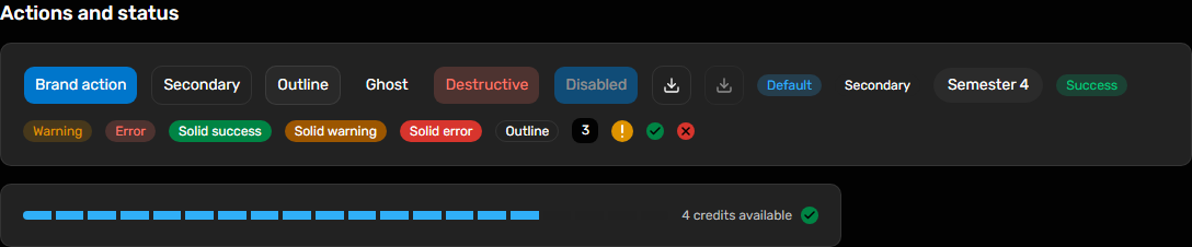
Actions and status # Use the component for this visual pattern; the consumer supplies data and workflow decisions.
Desktop · 1440px · package 0.1.0 @raisd-campus/design-system/ui/button @raisd-campus/design-system/ui/badge @raisd-campus/design-system/system/status-indicator · Versioned catalogue
Enabled triggers use a pointer cursor; disabled interaction and header geometry remain unchanged. Consumers supply title typography. Read-only file values can use the standard DetailField label/value columns with FileUploadField as their value.
Desktop · 1440px · package 0.1.0 Accordion · Collapsed · 1440px · package 0.1.0 @raisd-campus/design-system/ui/accordion · Versioned catalogue
Shared package
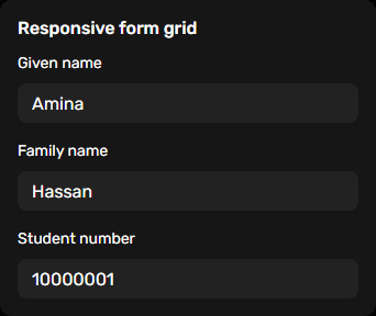
Responsive form grid # Use the component for this visual pattern; the consumer supplies data and workflow decisions.
Desktop · 1440px · package 0.1.0 Responsive form grid · phone · 390px · package 0.1.0 @raisd-campus/design-system/system/form-grid · Versioned catalogue
Shared package
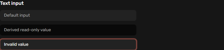
Text input # Standard single-line inputs use 36px height, 14px text and 20px line height on phone, tablet and desktop, including coarse pointers.
Desktop · 1440px · package 0.1.0 @raisd-campus/design-system/ui/input · Versioned catalogue
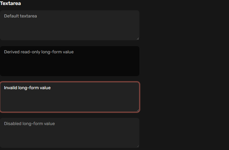
Use the component for this visual pattern; the consumer supplies data and workflow decisions.
Desktop · 1440px · package 0.1.0 @raisd-campus/design-system/ui/textarea · Versioned catalogue
Shared package
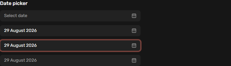
Date picker # Date triggers use the standard 36px height, 14px text and 20px line height in all views and pointer modes. Calendar interaction and focus return remain shared.
Desktop · 1440px · package 0.1.0 @raisd-campus/design-system/ui/date-picker · Versioned catalogue
Shared package
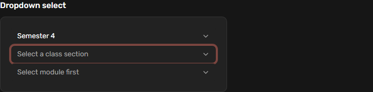
Dropdown select # Dropdown triggers use 36px height, 14px text and 20px line height in all views and pointer modes, with data-slot=dropdown-select-trigger.
Desktop · 1440px · package 0.1.0 @raisd-campus/design-system/ui/dropdown-select · Versioned catalogue
Shared package
Semester selector # Use the component for this visual pattern; the consumer supplies data and workflow decisions.
Desktop · 1440px · package 0.1.0 @raisd-campus/design-system/system/semester-selector · Versioned catalogue
Use the component for this visual pattern; the consumer supplies data and workflow decisions.
Desktop · 1440px · package 0.1.0 @raisd-campus/design-system/system/file-link · Versioned catalogue
Use the component for this visual pattern; the consumer supplies data and workflow decisions.
Desktop · 1440px · package 0.1.0 @raisd-campus/design-system/system/form-row-actions · Versioned catalogue
Shared package
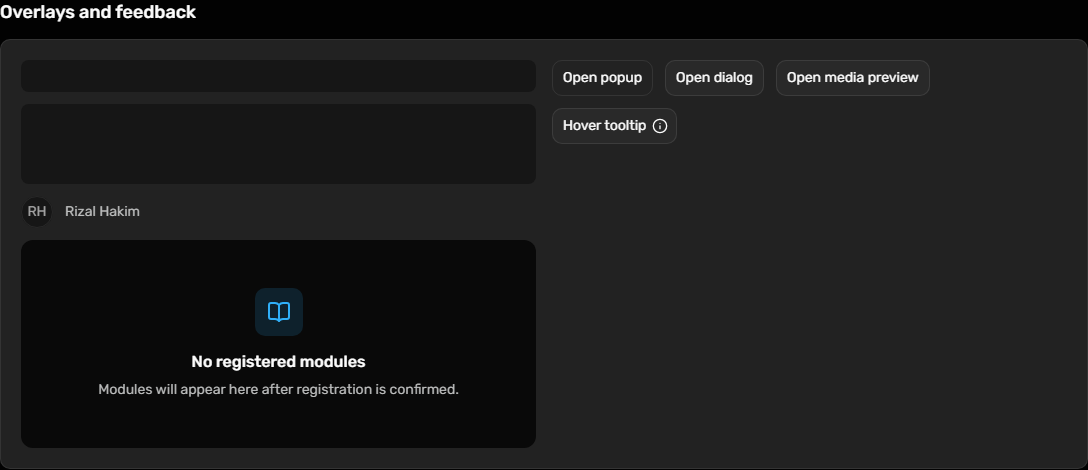
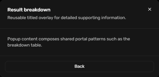
Overlays and feedback # Use the component for this visual pattern; the consumer supplies data and workflow decisions.
Desktop · 1440px · package 0.1.0 Overlays and feedback · Dialog open · 1440px · package 0.1.0 Overlays and feedback · Popup open · 1440px · package 0.1.0 @raisd-campus/design-system/ui/dialog @raisd-campus/design-system/system/popup @raisd-campus/design-system/system/media-preview-lightbox · Versioned catalogue
Shared package
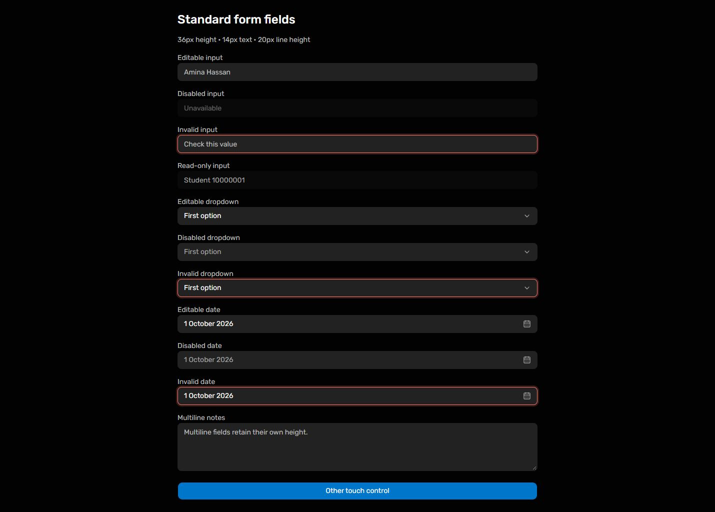
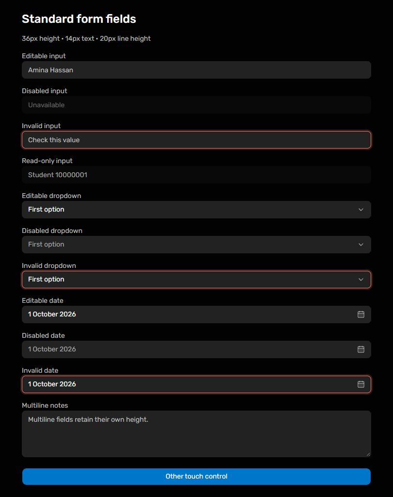
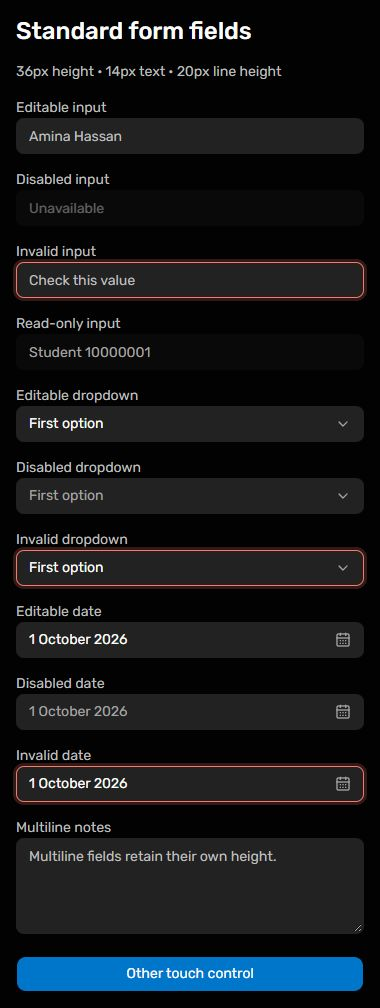
Standard form fields # Input, DropdownSelect and DatePicker share 36px height, 14px text and 20px line height across all views and pointer types, including disabled, invalid and read-only states. Textareas retain multiline height; other touch controls retain their existing targets.
Desktop · 1440px · package 0.5.2 Tablet · 820px · package 0.5.2 Phone · 390px · package 0.5.2 @raisd-campus/design-system/ui/input @raisd-campus/design-system/ui/dropdown-select @raisd-campus/design-system/ui/date-picker @raisd-campus/design-system/ui/textarea · Versioned catalogue
 Control Plane